May 21, 2019 / Trend
Colour Navigation
The psychological effects of colour have been studied and measured for years. With 95% of all cognition happening subconsciously, the importance of colour is key within retail spaces, helping to form emotional responses and guiding consumers to purchase.
Researchers found that our colour preferences derive from the objects we associate them with, and this evolution can be seen throughout our own lives and also in human history. It is no surprise then, that colour within retail will modify and adapt over time reacting to our own colour evolution.
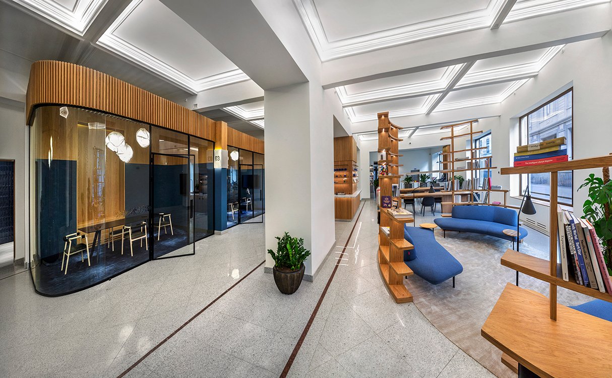
While some may think of red as just an indication of sales or blue hues inducing a calming effect, recent retail has taken a new approach, constructing innovative ways of using colour to help navigation, curiosity and storytelling.
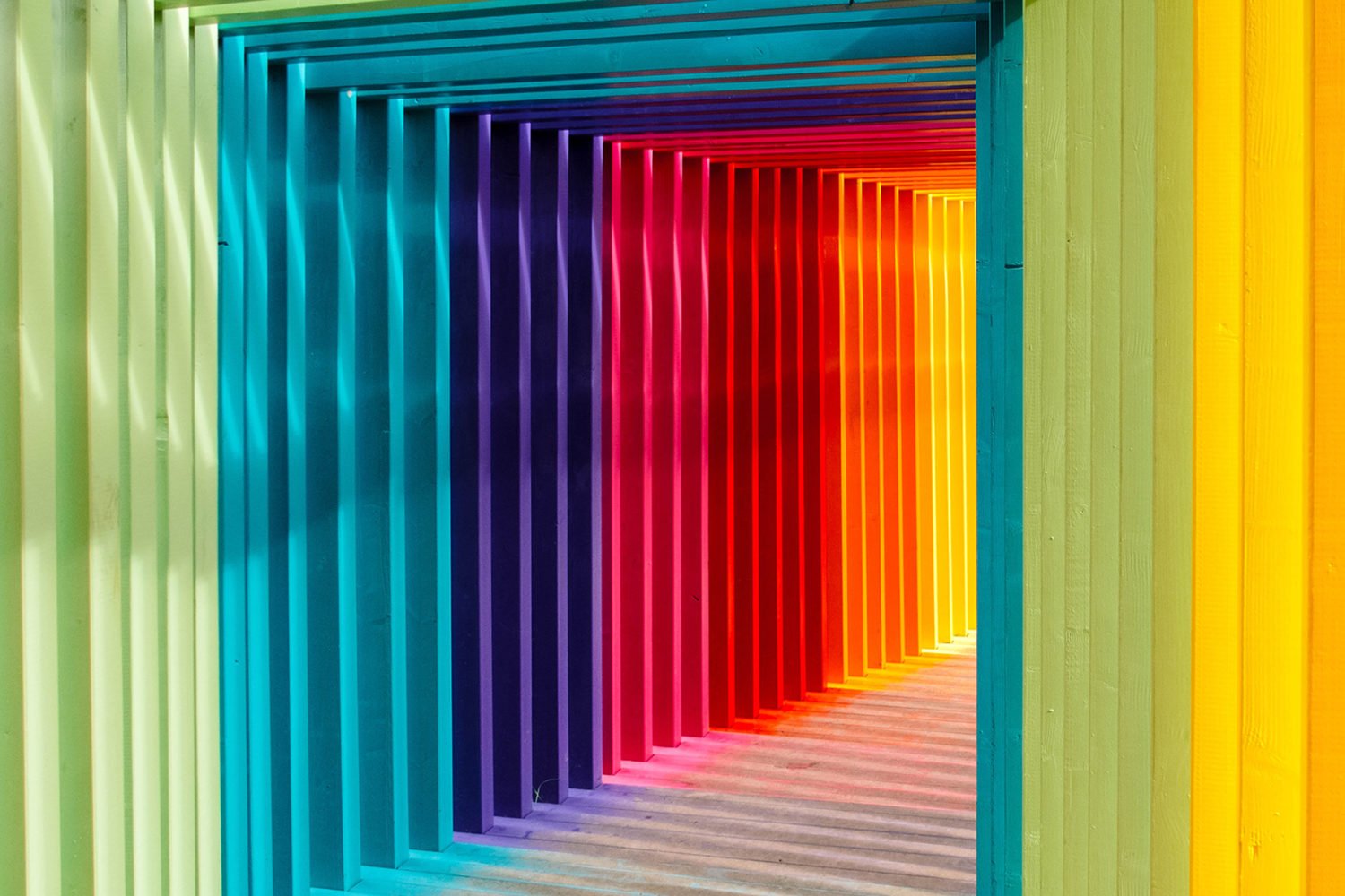
Colour blocking within store is a trend that is beginning to emerge, with MACY’S x STORY collaboration using colour blocking in an atypical way. STORY’s narrative-driven merchandising is organised by colour, creating cross-category sections to help aid consumer curiosity and discovery.
The experience feels a lot like a real-life version of scrolling through Instagram. You discover things you weren’t looking for but are inspired by all the fun finds – the second you see it, you need it!
Rachel Schuman, Founder of StoryThe use of colour to inspire navigation is not unique to MACY’S X STORY. Lush recently debuted their new packaging free concept at SXSW. The use of clear shelving accentuated the colour of the product, though the irony was not lost on how much plastic was used to make the shelving.
More than just visually appealing, the introduction of AI tech allowed consumers to hold up their phones to access product information. This made the digitally enhanced space intuitive to navigate, using colour as an immediate guide to preferred products, but also limiting the amount of signage needed, drawing full attention onto the products.
Digitally-native company Hungryroot recently opened a pop-up in New York, using colour bright blocking to categorise food groups. The use presence of bold colours creates a striking space, while also making it easy for consumers to find grains, sweets or ‘jazzy extras’. The use of colour was a playful way to draw attention to the store, devise easy navigation and also create sharable moments for social media in an authentic way.
The adoption of bold colour coordination is set to thrive and bloom, as this burgeoning trend starts to disrupt traditional store navigation, providing consumers with enlivening visual aesthetics and engaging the curious nature of humans.
Key Insights
- Disrupting traditional notions of store navigation will delight and enhance a consumers experience. Tailoring navigation to the needs of a brand and consumer in a creative way is sure to help brands standout and connect authentically.
- Brands should consider consumers emotional responses to colour by devising dynamic and visually enticing consumer journeys around product placement and store navigation.
- The use of standout colour also presents an Instagrammable moment for consumers, which should not be underestimated when considering shareability and the use of the omnichannel within store.